I love painting rocks and water- it’s almost as good as a walk by the seashore on a day when I can’t get out there myself. Physically I may be in my studio, but mentally I’m on that path around the headland on a sunny day in September!
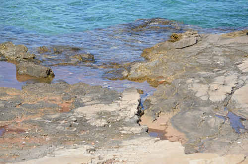
My photo of rocks and seashore
Today, my reference photo is chosen for its happy combination of blue-green sea and warm rocks in a kind of diagonal formation. I like the shifts of colour and the almost flowing appearance of the rocks. I imagine them building up layer-by-layer over time – quite a considerable time, and now they’re so solid and immoveable.

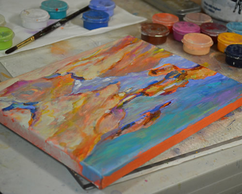
Starting with orange!
To start, I’ve picked out a small 8”x10” canvas and painted it a nice bright orange. That under-painting should give a lovely warm glow to the rocks, and it’ll gleam through the water in places, too. All my paintings are really about colour. It’s what makes my heart sing and the reason I lift my brush!
Working from the top down, I block in the main shapes with blue. Rocks are fairly forgiving so I can feel free to distort their shapes in whatever way occurs to me. You don’t have that freedom with every subject! I don’t generally like to paint an outline as I want the orange under-painting to show on some edges.
Here’s a slideshow of the painting as layers are added:
The rocks get a bit of starting definition with a light warm tone, which is followed up with yellow to brighten some areas. Peering at the photo I see that the rocks are actually grey in places, so a wash of french gray neutralizes and cools everything down. That swings the temperature a touch too far, so I warm it up again and start blending with my finger to make a solid shape. I don’t set out to make 3-dimensional forms, but I do want to contrast the hard rocks against the clear sea. A glaze of white gives the pools their surface, and a couple of white strokes livens up the water’s edge.
Successive layers adjust the balance of the dark against light and warm against cool as I add whatever colour seems appropriate at the time. I let that be an intuitive choice, as I’m not going for realism. This is how the scene feels to me. As I get to final touches, I take a smaller brush and add a few loose strokes and pay attention to the edges of the shapes – are they interesting enough? Does the painting convey the right mood?
Finishing the edges
It’s not always easy to know when to stop fiddling with a painting, but this one looks done to me. With one final adjustment to the foreground rock, I sit back to enjoy the effect. It’s taken me an hour and a half and here we have Painting Rocks! # 25 in the series.
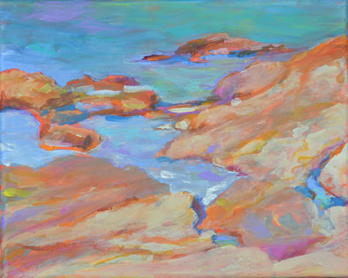
Painting Rocks! #25
And finally, here’s what another artist had to say:
“I found I could say things with color and shapes that I couldn’t say any other way – things I had no words for.” ~ Georgia O’Keeffe


Thank you, Mary. I appreciate your feedback. For some other subjects I do have a tendency to get wrapped up in details. Especially when painting outside!
Beautiful WIP presentation of your painting – wonderful form, and just love your color choices. Nice that you didn’t get wrapped up in details, but let the simplicity of values work for the painting. Love it.